Mi Yung’s Prayers - Brand Identity
A heartfelt brand mark inspired by a gifted illustration — balancing emotional depth with professional clarity for an adoption support service.
-
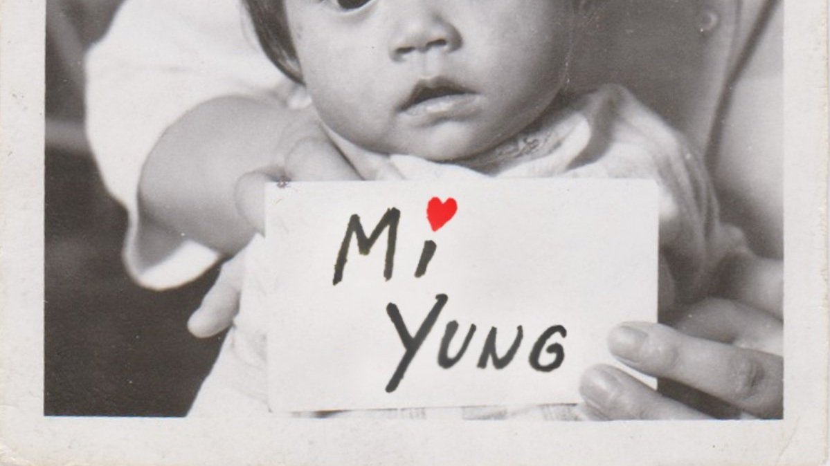
Mi Yung’s Prayers is a mission-driven organization offering guidance and support to families navigating the adoption journey. Rooted in compassion and ethical communication, the brand needed a calming, trustworthy visual identity to establish credibility and connect with future clients. At the start of her business, the founder sought a logo that would both represent her mission and resonate on a personal level.
-
The project presented a few creative hurdles:
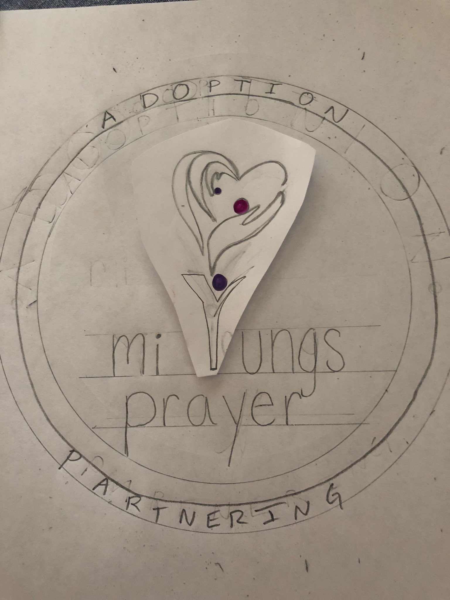
The client initially wanted a hand-lettered, warm logo, which shifted mid-process to reflect a meaningful illustration gifted by a friend.
Balancing personal sentiment with design functionality meant working within constraints while still delivering a professional, flexible mark.
Navigating multiple revisions with a highly specific creative direction required patience, adaptability, and design clarity.
-
We explored several directions before anchoring the design in the gifted illustration — a heart formed by wings and reaching hands, symbolizing care and connection. By refining this image into a scalable, versatile logo, I preserved the emotional weight of the artwork while ensuring it functioned across multiple brand touchpoints. I provided the client with several logo variations to suit different formats, from print to digital.
-
The final logo struck a meaningful balance between emotional storytelling and professional branding. It gave Mi Yung’s Prayers a memorable and authentic face — one that still represents the company six years later. The identity helped build early trust and recognition, playing a key role in the growth and continued presence of the organization.